Lodgicl
Lodgicl
A rapid, mobile prototyping project designing a new-to-market product for an insurance-tech startup.
Solving challenges in navigation and content organisation through ideation and iteration to go from concept to hi-fidelity prototype in just 2.5 weeks and help secure significant venture capital funding.
Year
Year
2024
2024
platform
platform
native mobile
native mobile
my roles
my roles
ideation
user flow
sketches, wireframes, mid fids
high fidelity prototype
design system
UX/ui design
product
management
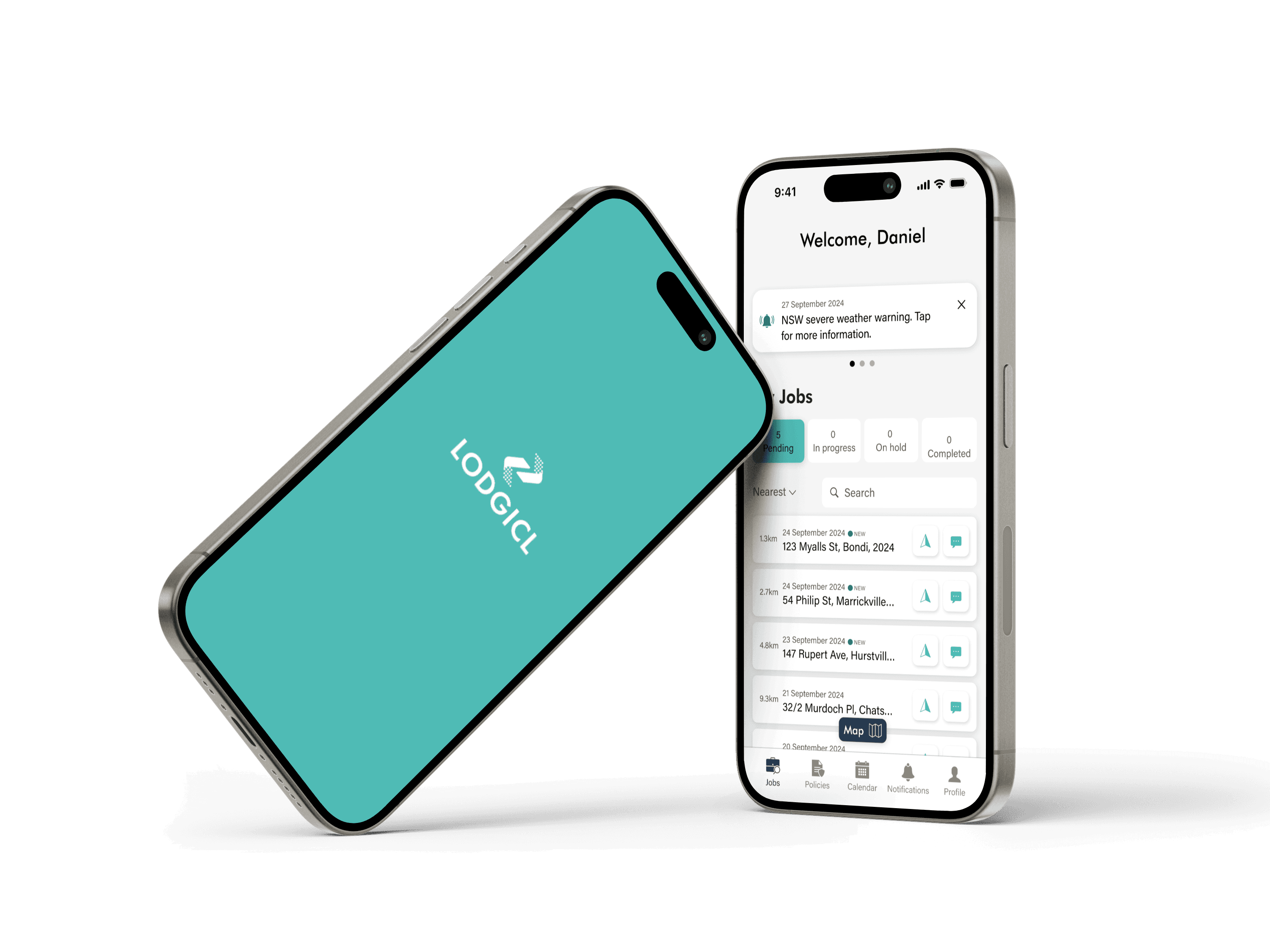


The problem
An Antiquated Industry
An Antiquated Industry
Repairmen and builders acting as damage assessors for insurance companies in Australia rely on outdated, manual processes to evaluate damage, compile reports, and communicate findings to insurers.
This leads to a cascade of inefficiencies: repetitive data entry, error-prone and hard-to-read reports, frequent back-and-forth clarifications, and wasted time for repairers who should instead be focusing on the repairs themselves.
The concept
The concept
A Revolution of the Assessment Process
A Revolution of the Assessment Process
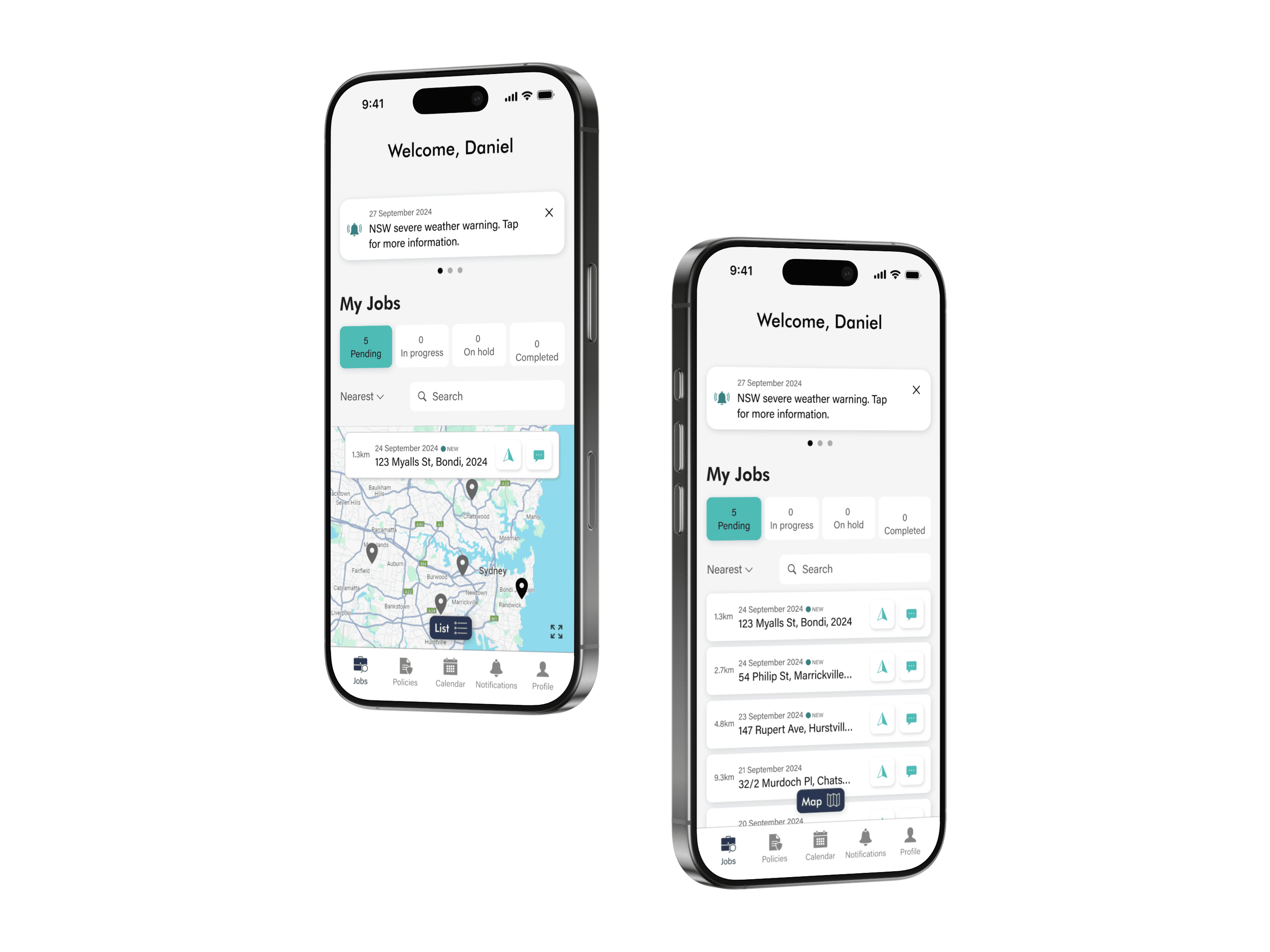
The founders’ concept was a mobile app that allowed assessors to complete their damage assessments on-site, receiving policy recommendations in real time.
The goal? Faster, more streamlined reports; ensuring better communication of findings with a higher degree of accuracy to insurers and policyholders.




my objective
my objective
Designing the Face of the Revolution
Designing the Face of the Revolution
My task was to translate the client’s concept into a high-fidelity, interactive native mobile prototype for user testing. I focused on designing a set of intuitive and flexible workflows that accommodated both first-time and expert assessors, not just meeting their on site processes but transforming them.
My task was to translate the client’s concept into a high-fidelity, interactive native mobile prototype for user testing. I focused on designing a set of intuitive and flexible workflows that accommodated both first-time and expert assessors, not just meeting their on site processes but transforming them.
"Lukas quickly got to grips with the details of our product and delivered a design that exceeded our expectations. His knack for coming up with smart solutions and refining ideas [has meant that] his work has been a huge part of how we communicate our vision in these early stages... We couldn't recommend him more highly"
"Lukas quickly got to grips with the details of our product and delivered a design that exceeded our expectations. His knack for coming up with smart solutions and refining ideas [has meant that] his work has been a huge part of how we communicate our vision in these early stages... We couldn't recommend him more highly"
"Lukas quickly got to grips with the details of our product and delivered a design that exceeded our expectations. His knack for coming up with smart solutions and refining ideas [has meant that] his work has been a huge part of how we communicate our vision in these early stages... We couldn't recommend him more highly"
IAN TULLOCH
IAN TULLOCH
Lodgicl CEO and Co-Founder
Lodgicl CEO and Co-Founder
the constraints
Limited User Research
Limited User Research
With only a two week turnaround my user research was limited to interviewing the client himself, who worked closely with assessors and knew the workflow well. I was provided a basic story structure for the prototype and some rough conceptual designs which served as a springboard for synthesis and development.
With only a two week turnaround my user research was limited to interviewing the client himself, who worked closely with assessors and knew the workflow well. I was provided a basic story structure for the prototype and some rough conceptual designs which served as a springboard for synthesis and development.
the process 01
the process 01
Understanding and Defining the User Flow
Understanding and Defining the User Flow
Through collaboration with the client I mapped out the ideal end-to-end user flow and the main assessment flow to ensure the app catered to the real-world workflows of the assessors and their needs while on-site. This meant I was able to identify potential bottlenecks and inefficiencies in the existing workflow that could be improved upon through design. It also clarified some of the app’s less obvious but just as necessary functionalities, such as the ability to move non-linearly between forms.
Through collaboration with the client I mapped out the ideal end-to-end user flow and the main assessment flow to ensure the app catered to the real-world workflows of the assessors and their needs while on-site. This meant I was able to identify potential bottlenecks and inefficiencies in the existing workflow that could be improved upon through design. It also clarified some of the app’s less obvious but just as necessary functionalities, such as the ability to move non-linearly between forms.
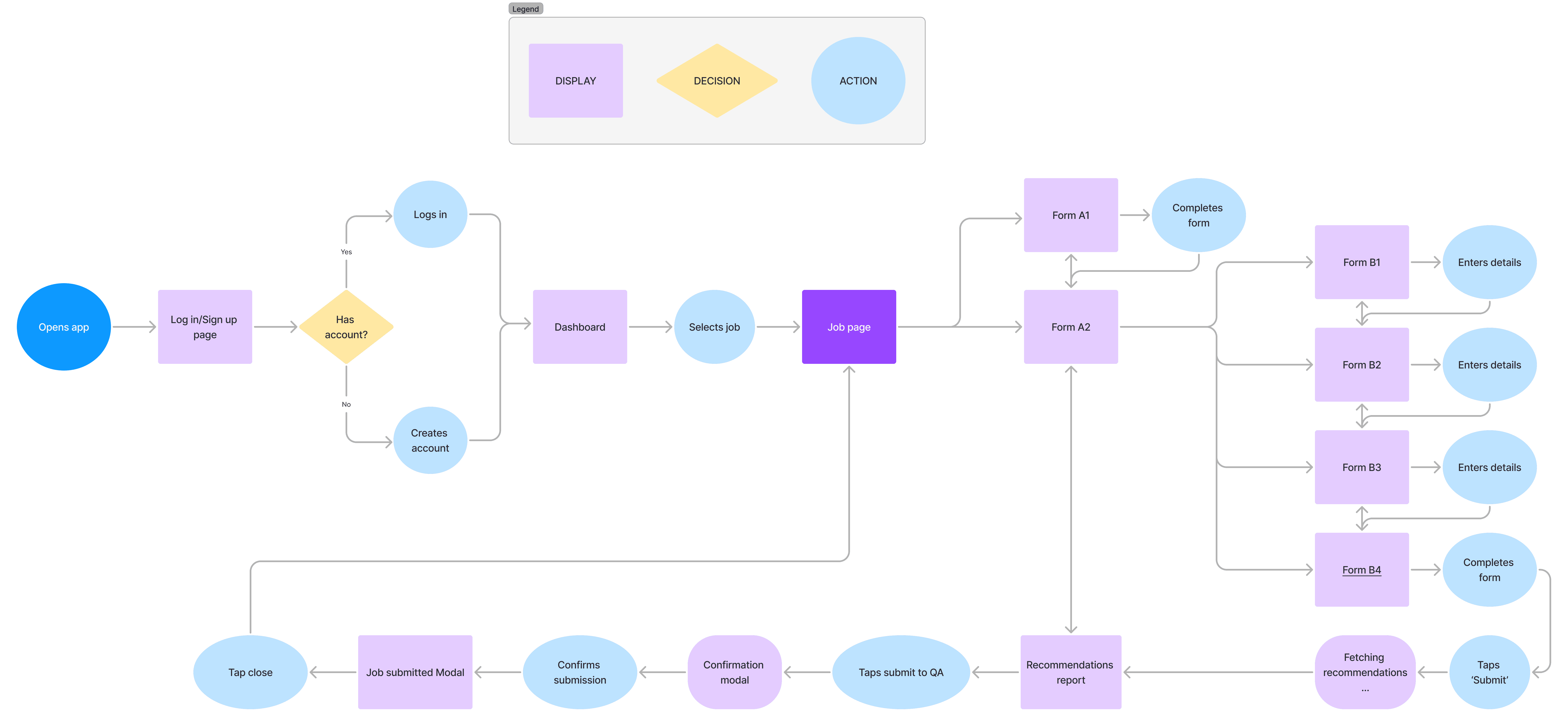
End-to-End Flow
End-to-End Flow

End-to-End Flow
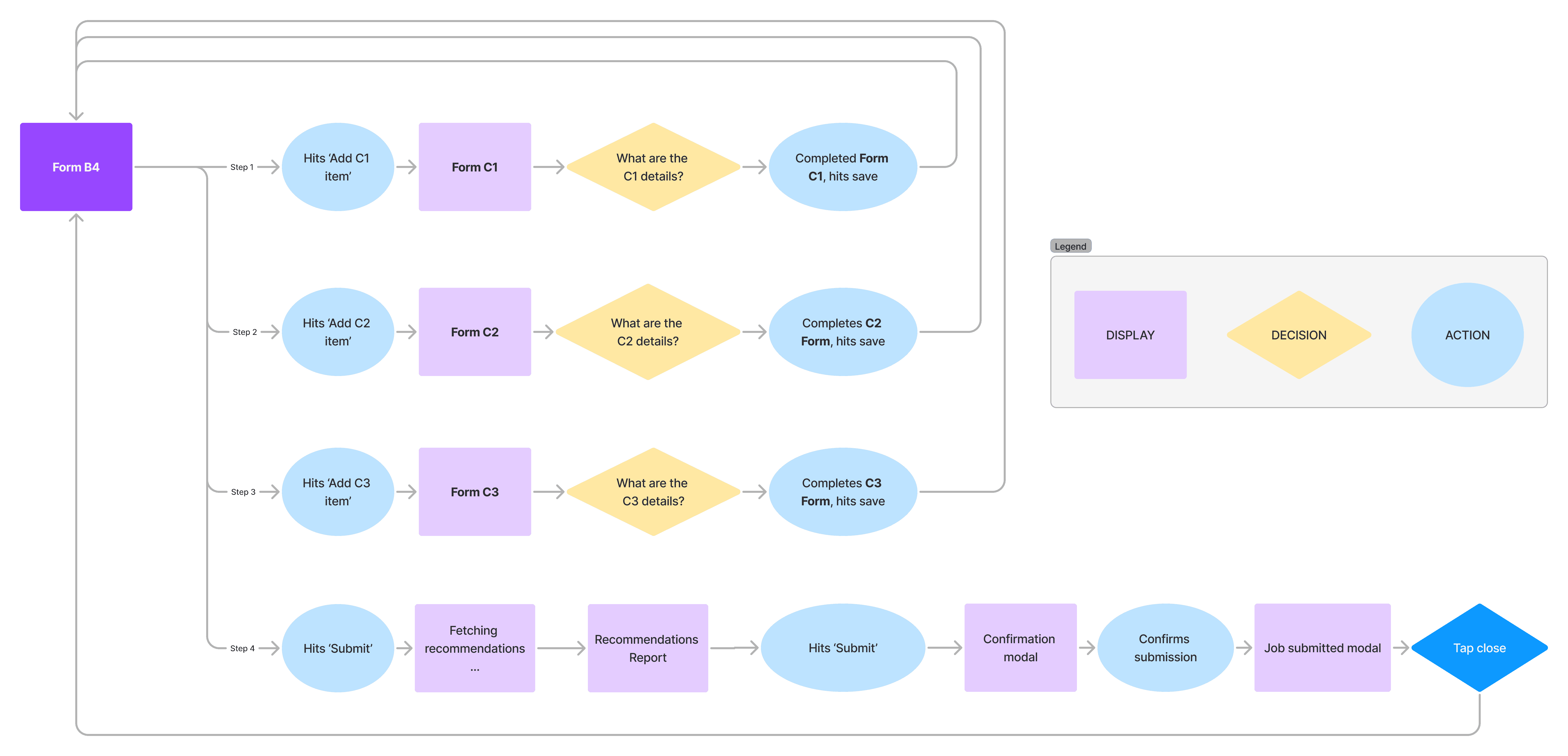
Main Form Flow
(Simplified)
Main Form Flow
(Simplified)

Main Form Flow
(Simplified)
the process 02
the process 02
Wireframes to Mid-Fidelity
Wireframes to Mid-Fidelity
With the user flow established, I designed wireframes for the damage assessment workflow, facilitating early feedback from the client and helping to align my design choices with their expectations. This meant when moving from low to mid-fidelity designs I could iterate quickly, refine the workflows, and validate that the structure and information architecture met user needs before progressing further to the high-fidelity prototype.
With the user flow established, I designed wireframes for the damage assessment workflow, facilitating early feedback from the client and helping to align my design choices with their expectations. This meant when moving from low to mid-fidelity designs I could iterate quickly, refine the workflows, and validate that the structure and information architecture met user needs before progressing further to the high-fidelity prototype.
Grab and drag to view


the process 03
the process 03
A Future-Proofed Design System
A Future-Proofed Design System
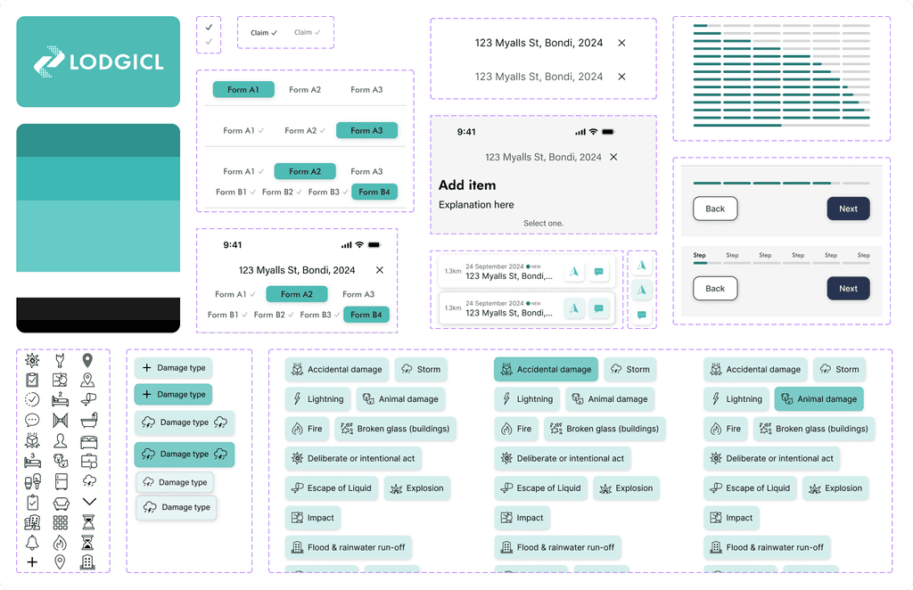
Given the project’s tight turnaround, I prioritised creating a robust design system early on in the process, ensuring I could keep consistency across the app while maintaining flexibility in responding to client feedback and enabling rapid iterations. I adopted an Atomic Design methodology, creating small components first that could scale and combine into larger components as the app grew or evolved. When a last-minute branding overhaul required significant changes to the design, this design system made it easy to incorporate the changes across all screens efficiently, without sacrificing time or quality.
Given the project’s tight turnaround, I prioritised creating a robust design system early on in the process, ensuring I could keep consistency across the app while maintaining flexibility in responding to client feedback and enabling rapid iterations. I adopted an Atomic Design methodology, creating small components first that could scale and combine into larger components as the app grew or evolved. When a last-minute branding overhaul required significant changes to the design, this design system made it easy to incorporate the changes across all screens efficiently, without sacrificing time or quality.


the prototype
the prototype
Multi-Step Forms to Ensure Accurate Data Capture
Multi-Step Forms to Ensure Accurate Data Capture
I broke down the traditionally lengthy and complex damage assessment form into a set of shorter, more manageable multi-step forms, with only one specific set of data being captured on each screen.
Clear progress indicators kept users aware of their position within each form - especially important for new or infrequent users.
This approach transformed the previously text-heavy process into a logical, guided experience, reducing cognitive load and user frustration, improving user focus and data accuracy, and minimising the risk of abandonment mid-task.





the prototype
the prototype
Flexibility for Seasoned Assessors
Flexibility for Seasoned Assessors
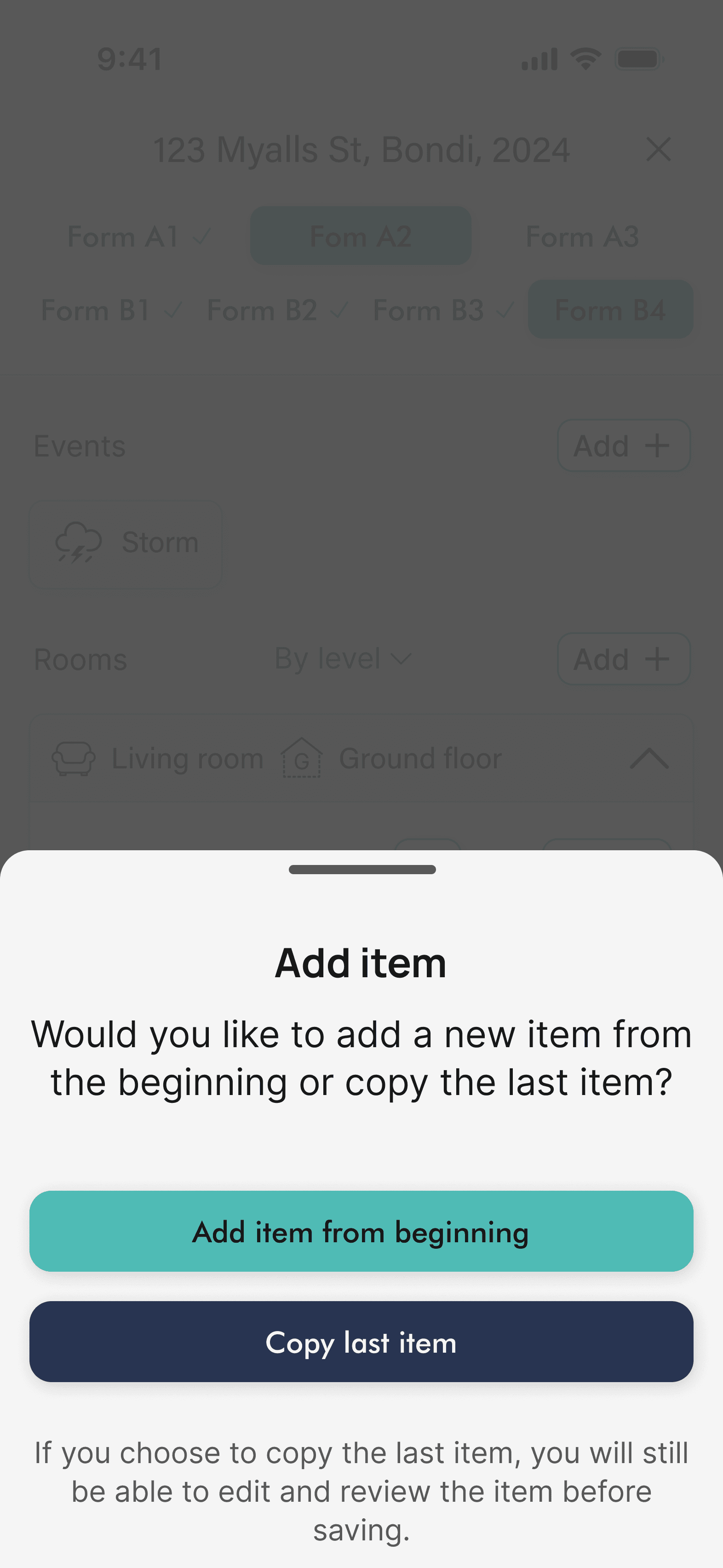
Advanced users often have different needs compared to novices. By allowing seasoned assessors to duplicate items using previous entries as a template, my designs accommodated their expertise and speed, meaning that for high-volume jobs, input could be sped up or bypassed altogether, supporting higher productivity and further reducing cognitive load.
Advanced users often have different needs compared to novices. By allowing seasoned assessors to duplicate items using previous entries as a template, my designs accommodated their expertise and speed, meaning that for high-volume jobs, input could be sped up or bypassed altogether, supporting higher productivity and further reducing cognitive load.
the outcomes
Substantial Funding and User Praise
Substantial Funding and User Praise
The founders secured significant venture capital funding after pitching a demo of my finished prototype.
Following testing, assessors praised the app’s ability to modernise a severely antiquated process and highlighted its intuitive interface for addressing real-world pain points in their current workflows.
"Lukas was fantastic to work with… [He] shared his ideas with confidence and clarity while always being open to feedback. We’re excited to keep working with him and couldn’t recommend him more highly!"
"Lukas was fantastic to work with… He quickly got to grips with the details of our product and delivered a design that exceeded our expectations. Lukas shared his ideas with confidence and clarity while always being open to feedback. We’re excited to keep working with him and couldn’t recommend him more highly!"
"Lukas was fantastic to work with… He quickly got to grips with the details of our product and delivered a design that exceeded our expectations. Lukas shared his ideas with confidence and clarity while always being open to feedback. We’re excited to keep working with him and couldn’t recommend him more highly!"
"Lukas was fantastic to work with… He quickly got to grips with the details of our product and delivered a design that exceeded our expectations. Lukas shared his ideas with confidence and clarity while always being open to feedback. We’re excited to keep working with him and couldn’t recommend him more highly!"

IAN TULLOCH
IAN TULLOCH
Lodgicl CEO and Co-Founder
Lodgicl CEO and Co-Founder
Other Work
Other Work
Whistle Clean
2024

Whistle Clean
2024
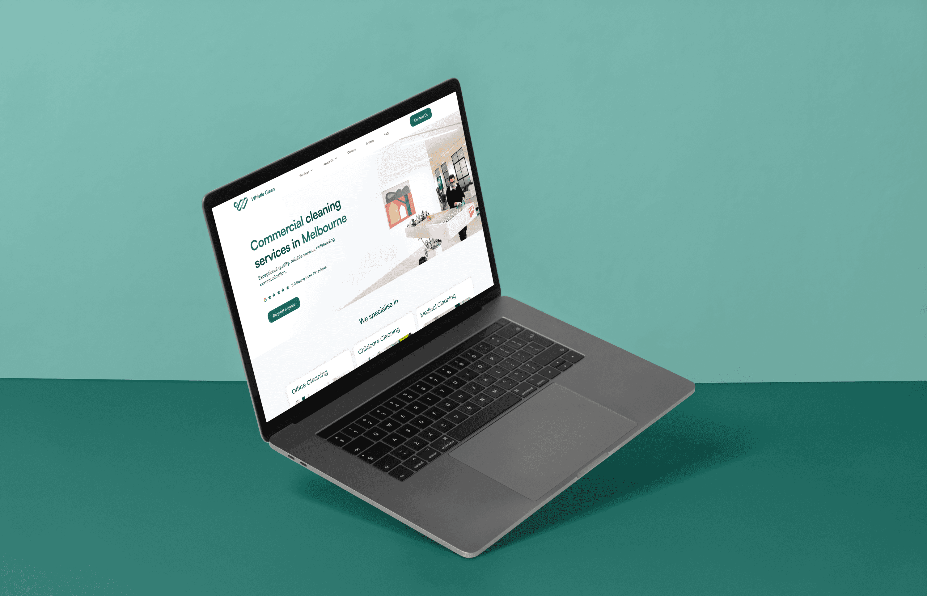
Elevating human stories to transform the cleaning narrative and boost SEO.

Whistle Clean
2024

Whistle Clean
2024
Elevating human stories to transform the cleaning narrative and boost SEO.
Unified
2024

Unified
2024
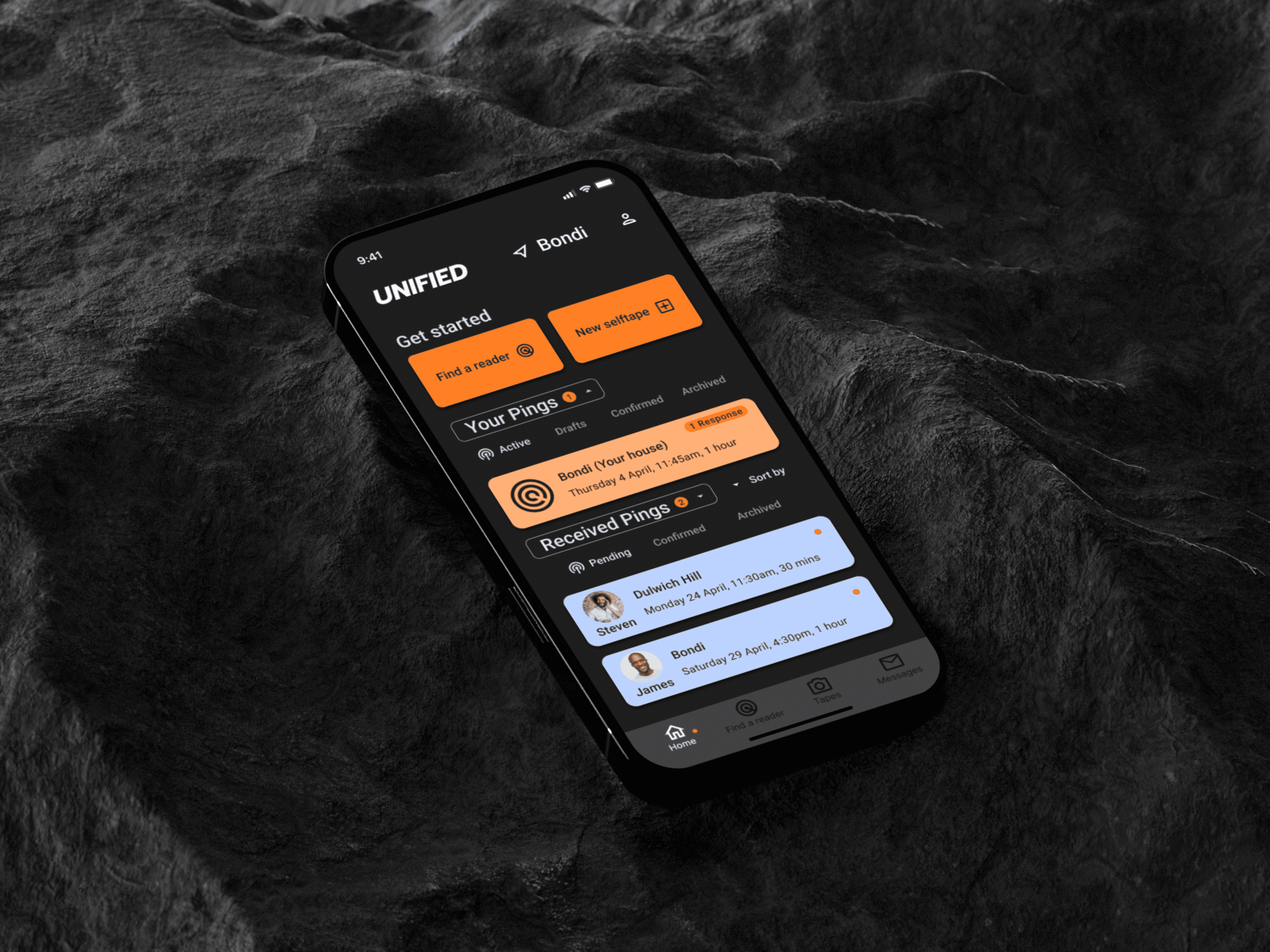
A digital bridge for actors in the modern era of self-tape auditions.

Unified
2024

Unified
2024
A digital bridge for actors in the modern era of self-tape auditions.
RoundTable
2025

RoundTable
2025
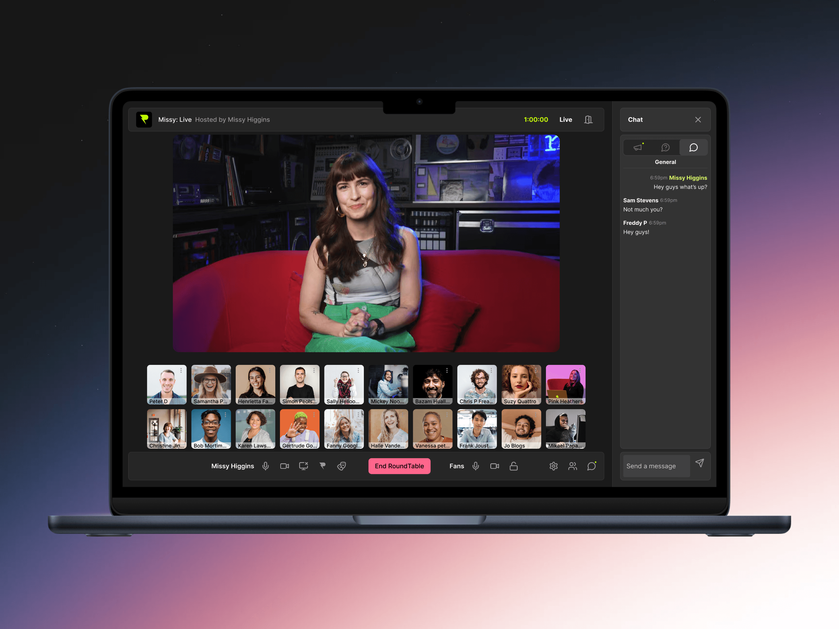
An MVP enabling creator and fan interactions via web-based virtual 'roundtabling'.

RoundTable
2025

RoundTable
2025
An MVP enabling creator and fan interactions via web-based virtual 'roundtabling'.
LUKAS WHITING 2024
BACK TO TOP
BACK TO TOP
LUKAS WHITING 2024
BACK TO TOP
BACK TO TOP