Whistle Clean Australia
Whistle Clean Australia
Leading a team of designers through a website redesign and SEO project for a commercial cleaning company.
A transformation and elevation of the cleaning narrative resulting in an increase in engagement rate and search engine rankings.
Leading a team of designers through a website redesign and SEO project for a commercial cleaning company.
A transformation and elevation of the cleaning narrative resulting in an increase in engagement rate and search engine rankings.
Year
Year
2024
2024
platform
platform
web + mobile (responsive)
web + mobile (responsive)
MY Roles
Team lead
seo & GOOGLE ANALYTICS
Ux/ui DESIGN
uX COPYWRITING
user testing
Team lead
seo & GOOGLE ANALYTICS
Ux/ui DESIGN
uX COPYWRITING
user testing


The problem
The problem
A Lack of Client and Workforce Growth
A Lack of Client and Workforce Growth
The client wanted to expand the company's reach and workforce via an improved online funnel.
The client wanted to expand the company's reach and workforce via an improved online funnel.
THE CONSTRAINTS
THE CONSTRAINTS
Time and 'Technical' SEO Knowledge
Time and 'Technical' SEO Knowledge
A 4 week turnaround meant limited time for user interviews and usability testing. We also had a team with limited 'technical' SEO knowledge.
Considering this I decided the best return would come from focusing on:
'On-page' SEO
The client's unique and captivating story (to drive engagement)
A simple, informative interface (to increase user-friendliness)
Before
Before
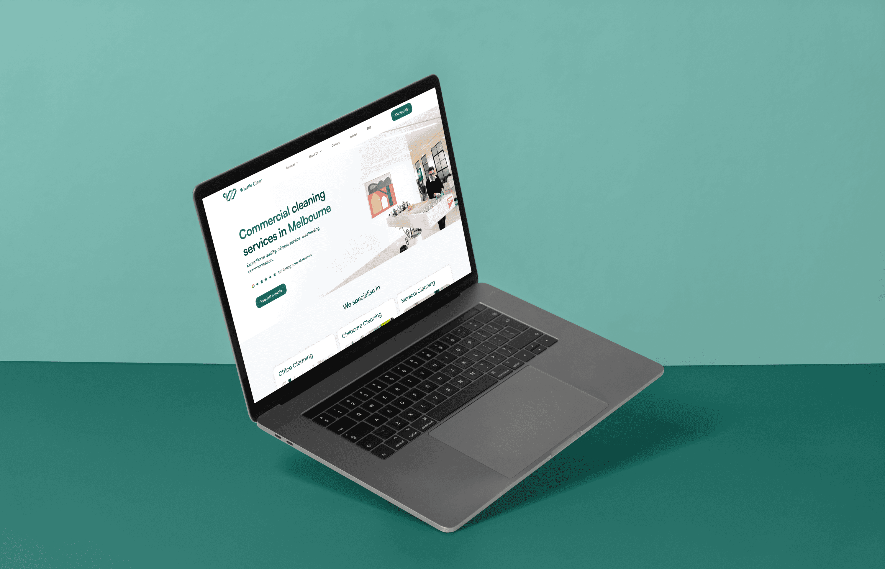
The existing website sacrificed user-friendliness and visual appeal for the sake of overemphasised SEO 'hacks'
The existing website sacrificed user-friendliness and visual appeal for the sake of overemphasised SEO 'hacks'
After
After
We brought SEO back into alignment within a sleek and minimal design, driving user engagement through a focus on storytelling.
We brought SEO back into alignment within a sleek and minimal design, driving user engagement through a focus on storytelling.
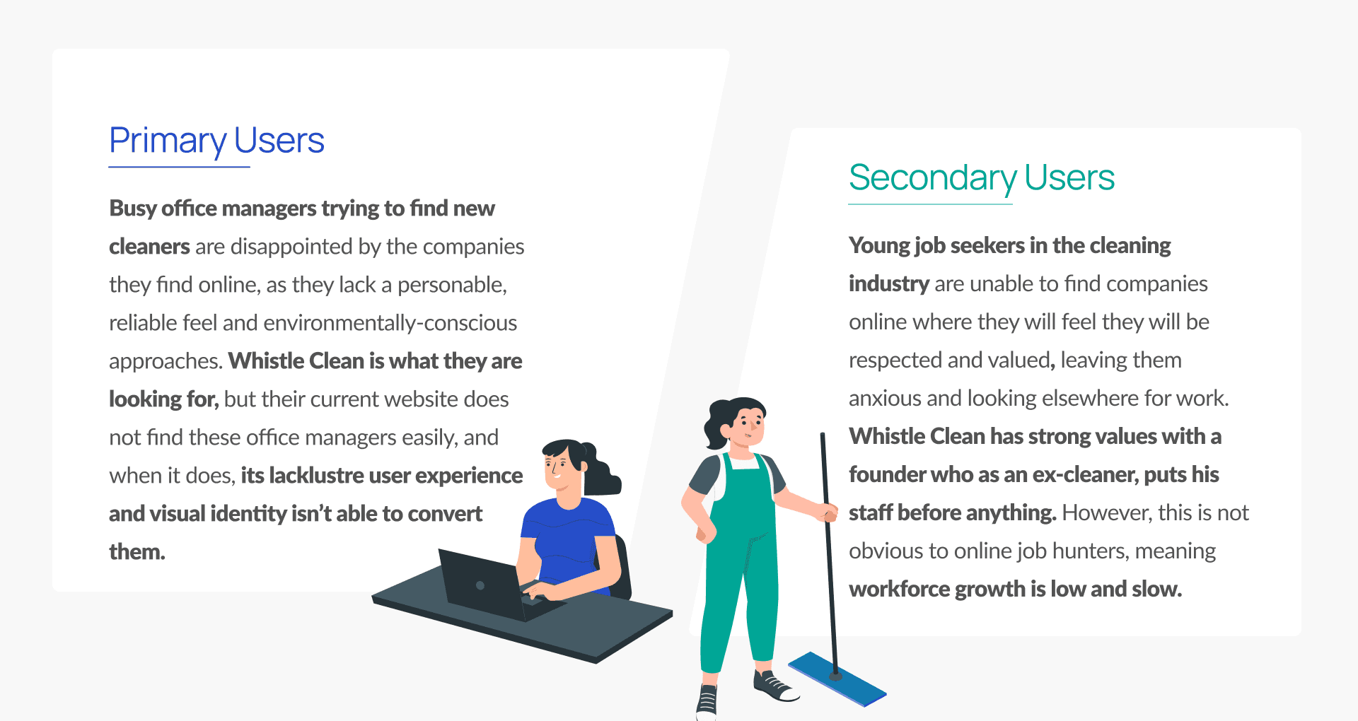
Dual goals, dual users
Client Growth = Office Managers, Workforce Growth = Job Seekers
Client Growth = Office Managers, Workforce Growth = Job Seekers
As the project's goals were to increase both the company's client base and the workforce, defining who these clients most often were, and what kind of background his ideal workforce had, was a logical first step.
As the project's goals were to increase both the company's client base and the workforce, defining who these clients most often were, and what kind of background his ideal workforce had, was a logical first step.


APPROACH
APPROACH
Evaluating What Wasn't Working
Evaluating What Wasn't Working
Unfortunately, time constraints and participant availability meant user research was limited. So instead we conducted a substantial heuristic evaluation of the existing site.
I led the team in distilling our final evaluation down to 7 overarching findings and recommendations to ease absorption for the client.


Click to expand
ideas galore
ideas galore
Generating More Ideas in Less Time
Generating More Ideas in Less Time
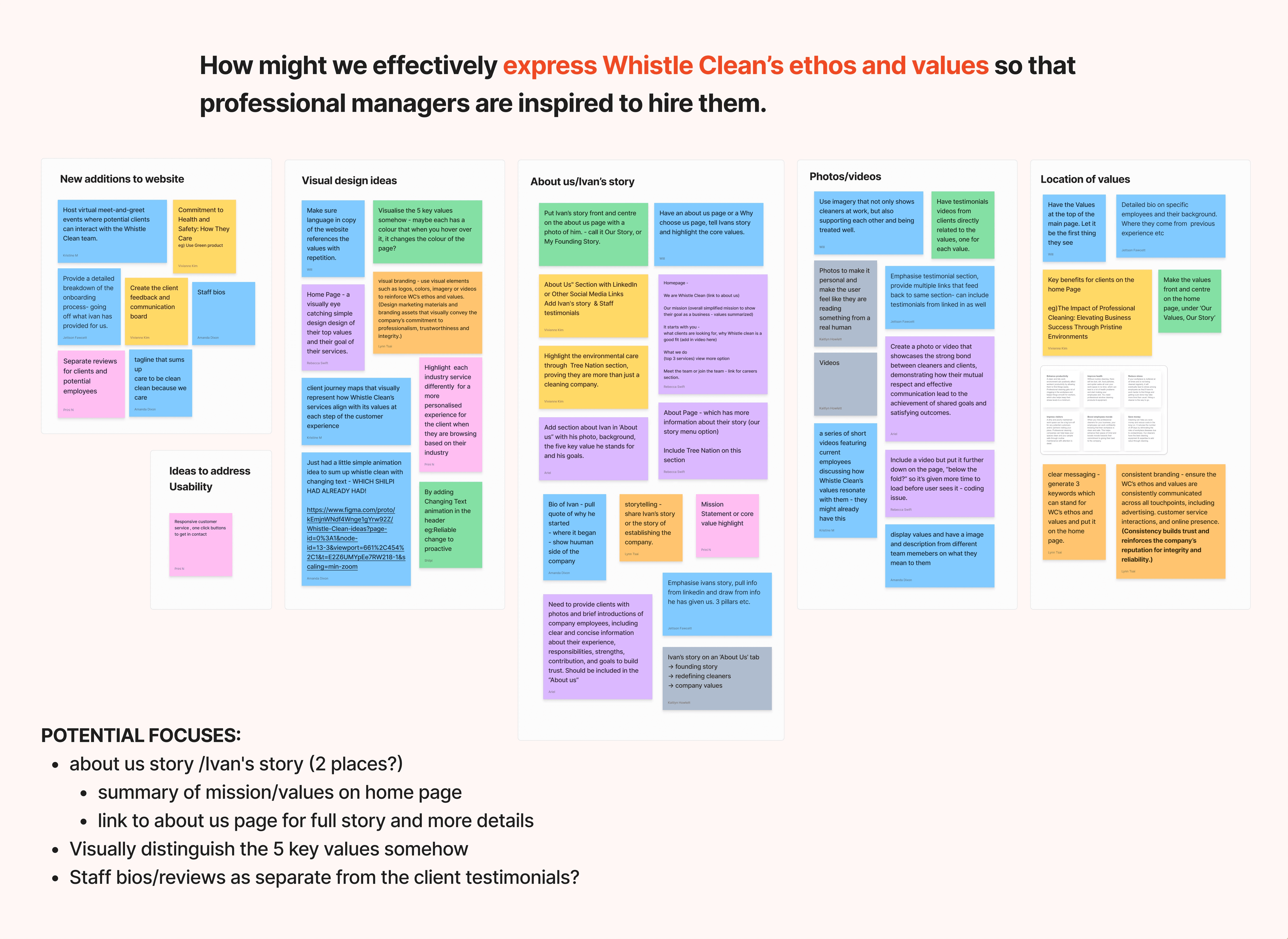
Once we knew where to focus, I led the team in synthesising and re-presenting the client's own persona and 'Ideal Client Profile' into two simple problem statements.
Then, to generate a greater number of ideas in a short amount of time, I led the ideation on four How Might We questions, using a variation on Crazy 8s (uniquely dubbed Crazy 4s). This meant we had more time to bounce off each others ideas once we'd come up with them, and more time to design a killer UI.
testing our choices
testing our choices
Battling Usability Tests Limited to Just 15 Minutes
Battling Usability Tests Limited to Just 15 Minutes
With the client (understandably) wanting to protect his client's time, we had 15 minutes only to test our early concepts.
So I led the team in formulating 3 short scenarios and tasks for the sessions, with follow-up questions only if time permitted.
The priorities to test were navigation, information discoverability, and the call to action process, which only needed the 3 main pages to be built in mid-fidelity.


mid-fidelity pages (click to expand)
mid-fidelity test pages
mid-fidelity pages
Home, About Us and Services.
Home, About Us and Services.
solving engagement
solving engagement
Affecting Users Through Authentic Storytelling
Affecting Users Through Authentic Storytelling
The client's founding story was captivating, so it was a priority to tell properly in order to give users a chance to be affected by it.
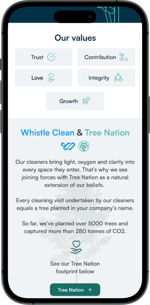
The company also had a partnership with a tree planting charity. However as this wasn't previously emphasised, users didn't know about it, despite considering environmental impact an important factor when choosing a cleaner.
I solved these issues by encouraging participation in the client's story from his own mouth via a video-focused carousel, and a more commanding visualisation of their environmental story where it could take centre-stage.


solving findability
solving findability
On-page SEO Strategies to Increase 'Stickiness' & Navigability
On-page SEO Strategies to Increase 'Stickiness' & Navigability
By building a more intuitive navigation, we would be boosting user-friendliness, and accentuating the client's drawcards - his founding story and company culture. This, along with the usual on-page bells and whistles would assist search engine crawlers and increase indexing considerably.
By building a more intuitive navigation, we would be boosting user-friendliness, and accentuating the client's drawcards - his founding story and company culture. This, along with the usual on-page bells and whistles would assist search engine crawlers and increase indexing considerably.
Overall UX enhancements
Mobile friendliness
NAP present and consistent
Intuitive IA
Sitemap & breadcrumbs
Answers to client questions
Founding story and ethos
Thoughtful use of key search terms
making cleaning attractive
making cleaning attractive
A Clean, Green, Smart UI
A Clean, Green, Smart UI
Users wanted to see a detailed breakdown of the types of cleaning offered by the company, but listing these individually would have been - put simply - boring. So instead I visualised their capabilities as 'limitless', answering the user's question before they asked it in a smarter, more visually appealing way.
I redesigned the clients video testimonial cards so that they played automatically, on mute and with the text alongside it. This avoided the effort of clicking and waiting for a video to load, meaning users could 'do' less and engage more.


the results
the results
A Transformation of the Cleaning Narrative
A Transformation of the Cleaning Narrative
The revamped website significantly increased SEO rankings, boosted user engagement, and saw the workforce grow substantially.
"Lukas led the design team with creativity and precision. His attention to detail and user-centric approach ensured our designs met the highest standards, establishing a cohesive and visually appealing design language. His combination of creativity, leadership, and technical expertise make him an asset to any team."
"Lukas led the design team with creativity and precision. His attention to detail and user-centric approach ensured our designs met the highest standards, establishing a cohesive and visually appealing design language. His combination of creativity, leadership, and technical expertise make him an asset to any team."

IVAN TAN
Whistle Clean Australia
Other Work
Other Work
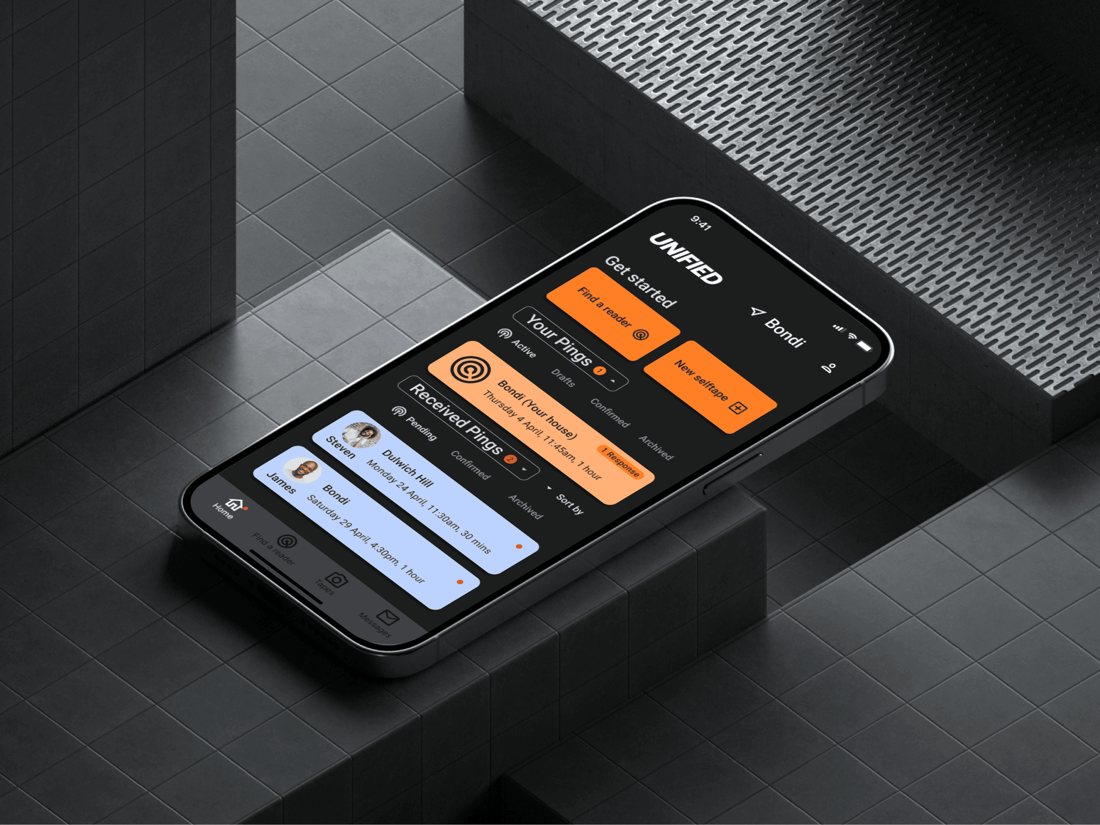
Unified
2024

Unified
2024
A digital bridge for actors in the modern era of self-tape auditions.

Unified
2024

Unified
2024
A digital bridge for actors in the modern era of self-tape auditions.
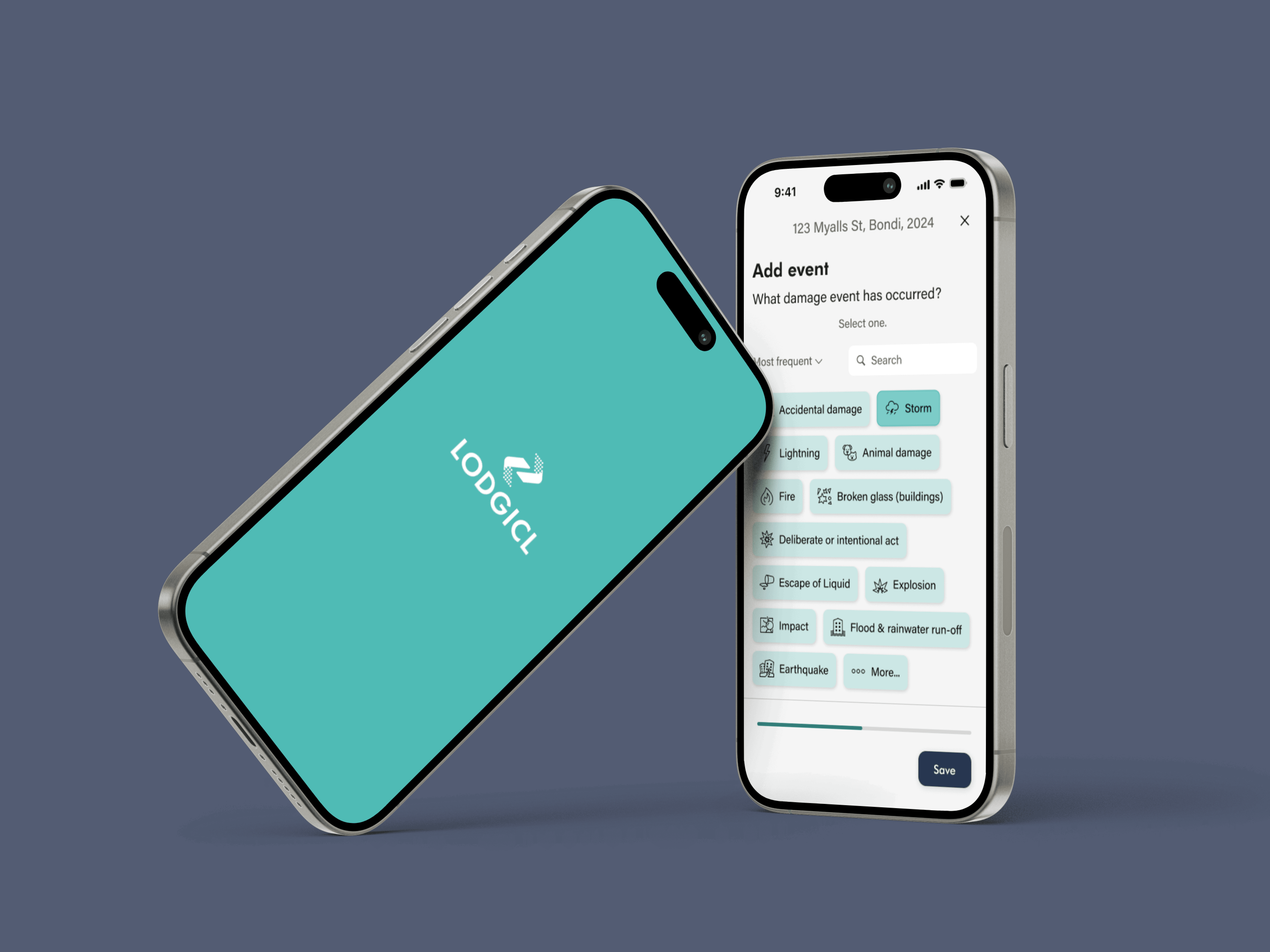
Lodgicl
2024

Lodgicl
2024
A rapid prototyping project to streamline on-the-ground insurance assessments.

Lodgicl
2024

Lodgicl
2024
A rapid prototyping project to streamline on-the-ground insurance assessments.
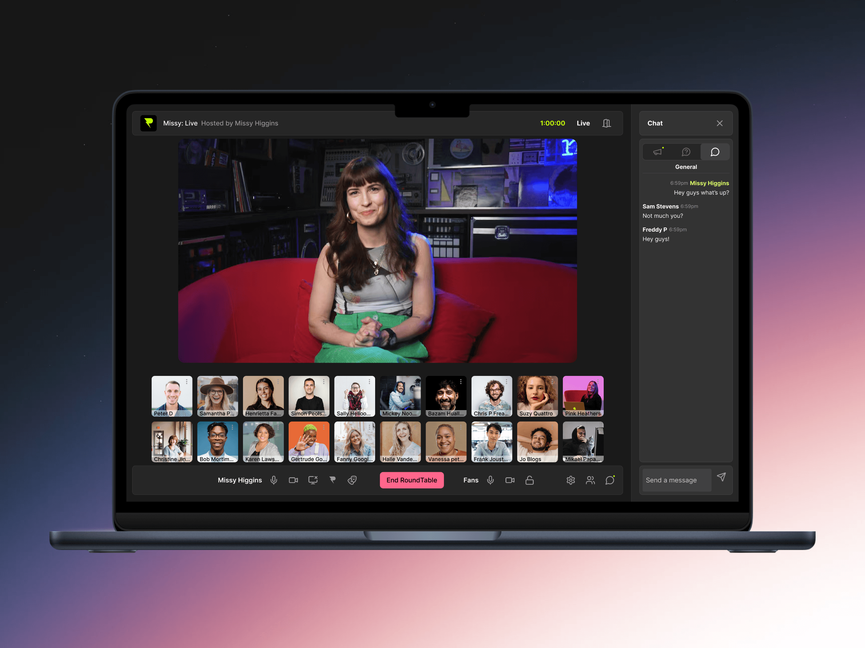
RoundTable
2025

RoundTable
2025
An MVP enabling creator and fan interactions via web-based virtual 'roundtabling'.

RoundTable
2025

RoundTable
2025
An MVP enabling creator and fan interactions via web-based virtual 'roundtabling'.
LUKAS WHITING 2024
BACK TO TOP
BACK TO TOP
LUKAS WHITING 2024
BACK TO TOP
BACK TO TOP


